

Of course, (and this approach is, I think, rather encouraged at all the IPRC workshops,) all advice is stuff you can either do or not. I feel very strongly that gut reaction trumps all established rules when it comes to things. If ultimately what you want to do is stuff that interests you, particularly in the creative world, why would you sacrifice that just to get yourself a little "safer"? Right? I love hints and advice and schedules; these things are shaping devices, a basic shape.

From there you can fill it in, or give it a pattern, or do whatever your heart desires.

But it's nice to have that basic shape in the first place. A good reference that you can choose to ignore if need be.
So when it was suggested that whilst honing in on a style you limit your color pallet -- this to a girl who had not long ago finished something like that elephant -- I basically snorted to myself, stuck it in parentheticals, and kept taking notes.
I think the idea was that there are so many factors in a finished piece that if you are bogged down with What Your Style Should Be, color is just going to be this gratuitous layer resting on an unstable foundation. And I get that, but at the same time I feel like if you are me and suddenly you are going from these brilliant colors (painstakingly selected mind you -- I am vibrant but I don't want things to look busy or accidental,) to a monochromatic color scheme for everything, well. You're doing something wrong.


Tons of previous examples notwithstanding.
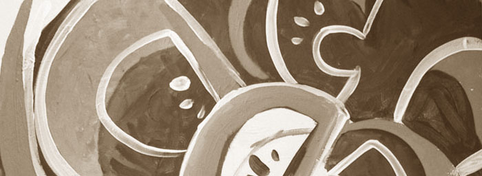
And then of course I started getting a little poorer. And my pencils got a little shorter. And I started that new marker + pencil + paper approach to drawing I've been so excited about, which was indeed very colorful. But then I got poorer. And I wanted to start playing with paint, particularly for Take Your Medicine, which I'd envisioned much bigger, and in acrylic. And in conjunction with this I was compelled by how great a simple marker-on-cardboard could look, and started doing sketches around town armed with only a dark grey marker, cardboard and a white pencil. This really dictated the final look of Take Your Medicine, really. Then the zine project started, which really forced me to look strictly at black and white. Then the t-shirt and the zine symposium entry, both of which were fairly calm color-wise.
While doing this I learning a lot. It's wonderful to let color take the front stage because I think it doesn't always get enough good press, and (again) I dig being very color-focused because I feel like I do it without it being overkill. (Ahem. If I do say so myself). That said, these projects reunited me with my long lost love, the line. "The Line" in terms of elements and principles of design. I love using lines, I love their expressiveness and how unassuming a line can be. The nature of these projects forced me to be a little less messy and really focus on a line that could hold its own, something that could reach out and grab you all on its own. Something that was bold enough to copy again and again. A much cleaner line. A simpler line.
My next few projects are back into the colorful realm, but interestingly I'm mostly focusing on a few colors. There are several reasons for this. Initially it was because these were my latest paint and marker purchases, and so it's to be expected, but these colors are very particular and specific. A pale yellow, a dark teal, a darker purple. A hint of light green, or maybe a regular yellow. There's variation within that, but for the most part that's where I'm at right now. And then too: I helped repaint Reading Frenzy when they remodeled, which got me thinking about blue and yellow again -- a combination very near and dear to me that goes back to grade school. I had a piece of fabric that (almost) matched the scheme they were going for, which I tacked up on my board for a while. So this also might be why I'm delving into these colors rather than that great pale purple or pinky orange I got at the same time.
Earlier this afternoon I was standing at the sink washing some brushes and I noticed, oh. The apples are definitely right in this scheme.

And now that I think about it, so is my business card.
Really I get into color moods all the time. When I first got into painting it was all purple all the time, sneak purple into everything. (Particularly polar bears. Trust me.) Then while I was working at Pier One I got really into this peach-mulberry-lime combination I'd seen in an old handbook/catalog we'd kept in a drawer up at the cash stand. And now it's this. But it's neat to think about in relation to what Keegan had said.
No comments:
Post a Comment